If you’re a web designer or developer who creates projects from scratch, you’ll know how challenging it is to find a UI kit that’s really functional. What if there was a way to have that customization be even more effortless to navigate and made it speedy to design the website you want?
In this post, we’ll take a look at Flowbite!!
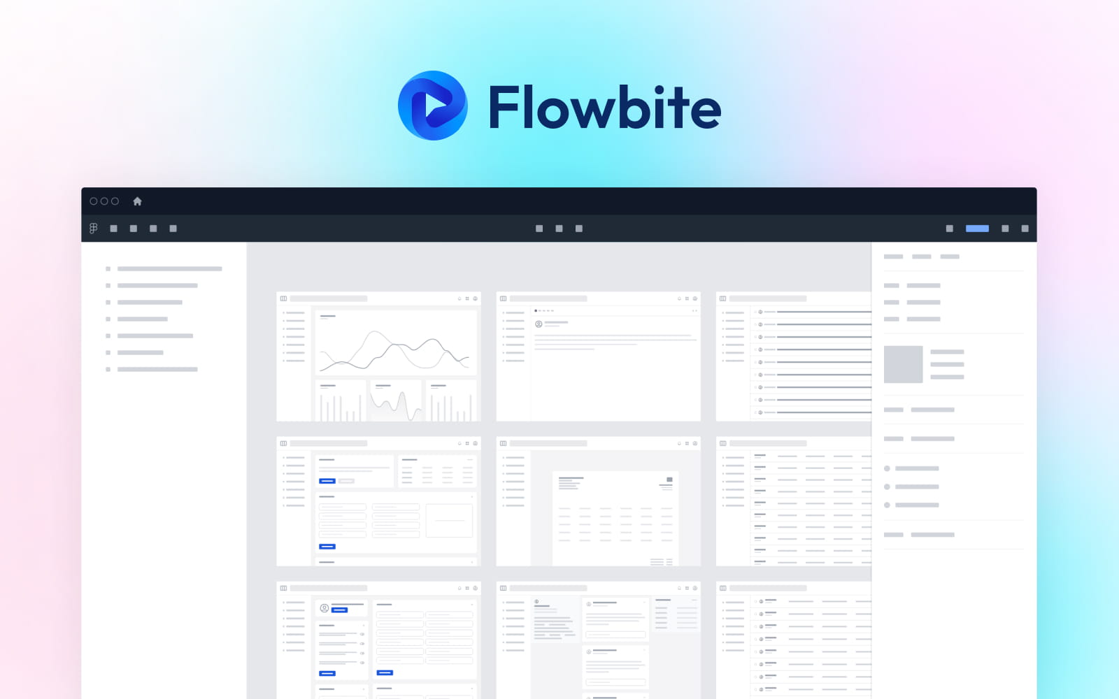
What is Flowbite?

Flowbite is an open-source set of web components built on top of Tailwind CSS including interactive elements as well, such as dropdowns, date pickers, modals, and more.
It was released in May 2021 by Zoltán Szőgyényi, Tanislav Robert and Victor Cordos .
This comes as a complementary solution to Tailwind’s utility-first framework which does not include a base set of components that you can use right away.
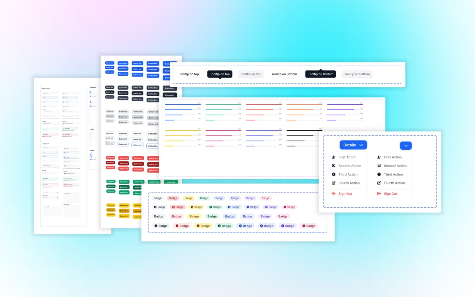
The Flowbite UI kit includes:
- 120+ block sections coded with Tailwind CSS
- 30+ open-source UI components and interactive elements
- Clear Documentation
- and much more!..
One of the disadvantages of Tailwind CSS compared to other frameworks is that it doesn’t have a base set of components. This makes it really hard to quickly prototype a user interface.
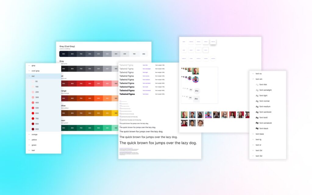
The Flowbite design system includes a uniform style guideline as the base of the components, sections, and pages such as a carefully selected color palette, font weights, shadows, and more.
What is a UI kit and Why do you need it?
A UI kit, or user interface kit, is an assemblage of assets that contains a set of design parts such as UI components and styles. UI components are elements that bring meaning and nourish functionality to users.
In short, The goal of a UI kit is to simplify the design process.
UI kits can help improve a design workflow in a number of different ways:
- Speed up the design process.
- Master your design skills.
- Achieve consistency in a design.
- Fewer problems and better functionality.
How Flowbite Works
Getting started with Flowbite by including it in your project is very simple. Once you’ve bought it, you’re able to download the two source file (Figma Design System / Application UI) from their website.
To get started, Import the file into Figma. Once you Import the file, then you will find out how to use this kit and Figma, introduction, style guide, and related stuff.
Flowbite Figma Design makes heavy use of powerful Figma features, including components, Auto Layout, and Variants.
Design UI interfaces and simplify the process of integrating into live websites with Tailwind CSS using this professional Figma design system featuring a style guideline, component variants, website sections, responsive pages, dark mode, auto-layout 3.0, grid layout, and even a playground when building new pages.
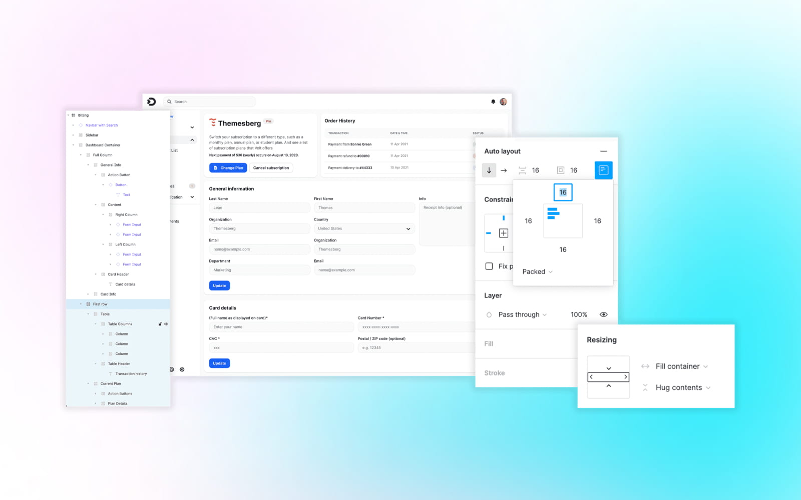
I’d advise reaching through all of the pages to get better learning of how everything performs – particularly if you haven’t used a design system like this before. Once you’ve introduced yourself, you can begin by adding your brand’s colors, logo, fonts, etc.
For Application UI you first need to make sure that you have a working Tailwind CSS project installed and that you also have Node and NPM installed on your machine.
Flowbite is a library of components built on top of the utility classes from Tailwind CSS and it also includes a JavaScript file that makes interactive elements works, such as modals, dropdowns, and more. To learn how to get started follow this quickstart guide.
Honestly, that’s all I can say
“Flowbite UI Kit has been playing a significant role in our work. It’s helped me save dozens of hours of work and taught me to do the best way to work! ”
MahdiAli Khanusiya (Founder & CEO at ilmosys)
That’s it. I hope you found this review valuable, and let me know in the comment section below if you ever select to try this UI kit.
Thank you!