If you’re a frontend dev tired of building layouts from scratch, or just looking for sleek, responsive UI templates built with Chakra UI, you’re in the right place. Whether you’re whipping up a quick MVP, exploring Chakra UI layout possibilities, or hunting for a Chakra UI template free download, this list has got you covered.
We’ve handpicked some of the best Chakra UI templates to offer—complete with ready-to-use components, authentication flows, and beautiful themes. Plus, we’ll sprinkle in some extra goodies like a Chakra UI cheat sheet and a Chakra UI theme generator to supercharge your workflow.
Master UI fundamentals before diving into Chakra UI. Let’s dive into these Chakra-powered gems.
1. Argon
Chakra UI Argon is a modern and elegant admin dashboard template built with React and Chakra UI. Designed by Creative Tim, this Chakra UI template offers a highly responsive interface with a clean and minimalist layout. It comes preloaded with useful components like charts, tables, and cards, all styled with Chakra UI’s design system.
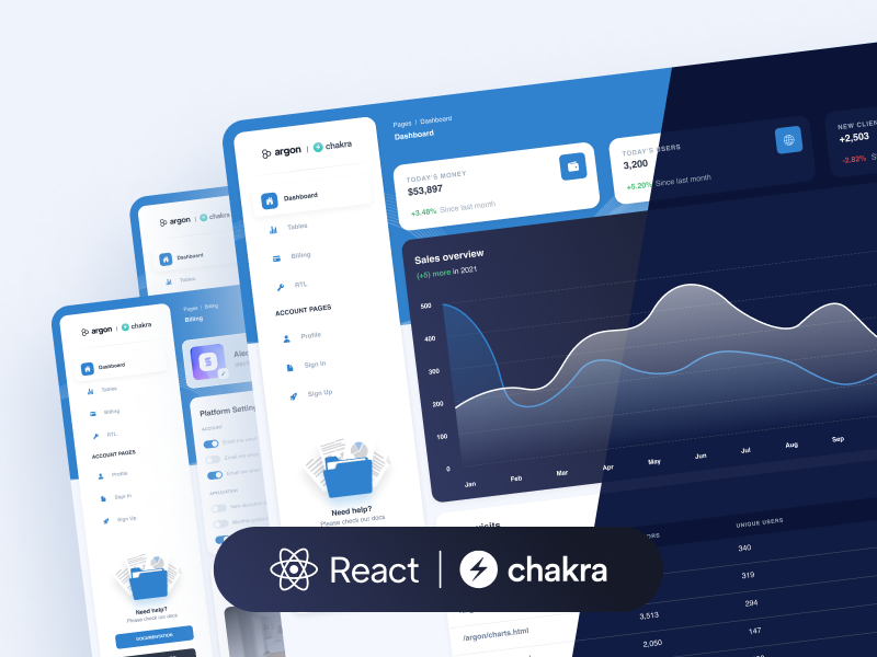
The sidebar navigation, responsive layout, and dark/light mode toggle make it ideal for backend interfaces. Whether you’re creating a CRM, analytics dashboard, or admin panel, this template helps you get there faster.
- Features: Light/dark mode, pre-built widgets, charts
- Use Case: Dashboards, analytics, admin panels
2. Astratech Landing Page
Astratech is a sleek and simple landing page template built using Chakra UI. It’s designed with startups and SaaS products in mind. The layout features modern UI blocks like a hero section, pricing plans, testimonials, and calls-to-action — everything you need to make a great first impression.

Its minimalistic design keeps user attention on your core message, and the mobile responsiveness ensures it looks great on all devices. Astratech is ideal for product promos, launches, or any one-page marketing site.
- Features: Hero section, pricing, testimonials, CTA blocks
- Use Case: Landing pages, marketing
3. Horizon
Horizon UI is a powerful admin dashboard Chakra UI template. It’s tailored for complex interfaces that require performance, usability, and modern design. The template includes components like dynamic charts, data tables, notifications, and sidebar navigation.

It supports responsive design and theming with Chakra’s intuitive styling system. Developers will appreciate the modular architecture and clean codebase, making it easy to customize and scale. Whether you’re building SaaS admin tools or internal dashboards, Horizon UI is a strong choice.
Other than Chakra, Horizon provides amazing templates for Shadcn users too, if you are a Shadcn UI enthusiast, do check out these best Shadcn UI Components.
- Features: Responsive layout, side nav, modular components
- Use Case: Enterprise dashboards, SaaS panels
4. Mentor
Chakra UI Mentor is a thoughtfully designed personal site UI template perfect for mentors, developers, and freelancers. It features a dark theme, smooth animations, and a responsive design. Sections include About Me, Projects, Skills, and a Contact form — ideal for showcasing your professional identity.

It’s built with Chakra UI and optimized for performance and readability. With clean code and accessible components, this template helps you build a strong online presence quickly.
- Features: Skills section, contact form, resume
- Use Case: Developer portfolios, personal branding
5. Nextarter
Nextarter Chakra combines the power of Next.js with Chakra UI to give developers a ready-to-use starter template. It comes pre-configured with SEO settings, dark mode, TypeScript, and optimized Chakra UI layout styles.

Whether you’re launching a new blog, building a portfolio, or starting a new SaaS app, this boilerplate Chakra UI template saves time and ensures best practices. It’s clean, minimal, and designed for scalability.
- Features: SEO friendly, TypeScript support, pre-configured Chakra UI layout
- Use Case: Any React project, blogs, SaaS apps
6. Portfolio Landing Page
This Chakra UI template is the go-to option for developers and designers looking to showcase their work online. It includes sections for About, Projects, and Contact, along with smooth scrolling and subtle animations.

Built to be mobile-friendly and lightning-fast, Portfolio focuses on content-first design with a minimal aesthetic. It’s perfect for resumes, developer portfolios, or simple personal websites that need clarity and style. Add beautiful icons to your Chakra UI layouts with these free icon libraries!
- Features: Mobile-friendly, minimal design, animations
- Use Case: Portfolios, resumes
7. Purity
Purity UI is a premium-quality dashboard template made open-source by Creative Tim. It features a stylish card-based layout, with a variety of reusable Chakra components.

With light and dark themes, custom UI blocks, and a fully responsive grid, Purity is ideal for modern dashboards, CRM systems, and project tracking tools. It has professional design polish and code that’s easy to modify, making it perfect for rapid development.
- Features: Fully responsive, detailed UI blocks
- Use Case: Admin panels, CRM systems
8. Senco
Senco is a robust starter project using Chakra UI and Next.js. It includes theming support, pre-built pages, and a suite of UI components such as buttons, cards, navbars, and modals.

The template is built for speed and modularity, offering a perfect foundation for building full-scale applications. The code structure is clean and easy to navigate, making it ideal for beginners and advanced users alike.
- Features: Modular design, integrated icons, layouts
- Use Case: Landing pages, product showcases
9. TemplatesKart Components
TemplatesKart is a component goldmine for Chakra UI developers. It features a huge collection of reusable elements such as buttons, badges, modals, cards, and layouts.
The repository is ideal for designers and developers building a custom design system or needing rapid prototyping tools. The UI is clean, modern, and designed to be plug-and-play. You can easily extract individual components and use them across various projects.
- Features: UI elements library, fully customizable
- Use Case: Rapid prototyping, UI design systems
10. Vision
Vision UI is a highly animated and futuristic Chakra UI template perfect for startups and creative portfolios. It features a mix of glassmorphism, gradients, and motion effects that make it visually striking.

With dark and light modes, call-to-action blocks, and modern layout design, Vision is both aesthetic and functional. It’s a great fit for agencies, tech startups, and creative professionals who want to stand out.
- Features: Glassmorphism, animated sections, dark/light modes
- Use Case: SaaS, portfolios, creative websites
Chakra UI Cheatsheet 🚀
The Ultimate Quick Reference Guide for Developers
Whether you’re a newbie to Chakra UI or a seasoned pro, a cheatsheet is a lifesaver. Chakra UI is one of the most popular component libraries for React, loved for its accessibility, design tokens, and composability. But when you’re knee-deep in building a UI, remembering every prop and responsive syntax can slow you down.
So here’s your go-to Chakra UI Cheatsheet—a handy, concise guide covering components, props, responsive design, theming, and layout tricks. Speed up your Chakra UI design process with free mockup tools. Bookmark it, print it, or tape it to your forehead (okay, maybe not that last one).
Core Concepts You Need to Know
Chakra components like <Box>, <Flex>, and <Text> wrap HTML elements with styling props.
<Box bg="gray.100" p={4} rounded="md">
  Hello Chakra!
</Box>
Props like bg, p, rounded, shadow, etc., are built-in and mapped to the theme.
🔲 Box — Your Versatile Layout Friend
<Box w="100%" maxW="500px" bg="blue.100" p={4} borderRadius="lg" />Useful props:
w,h,maxW,maxHbg,p,m,borderRadius,boxShadowoverflow,display,zIndex
📐 Flex — The Layout Powerhouse
<Flex align="center" justify="space-between" p={4}>
  <Text>Left</Text>
  <Text>Right</Text>
</Flex>
Flex-specific props:
align,justify,direction(row,column)wrap,gap,grow,shrink- Responsive layouts with
direction={{ base: 'column', md: 'row' }}
🏷️ Text and Heading
<Heading size="lg">Title</Heading>
<Text fontSize="md" color="gray.600">Subtitle</Text>
Key text props:
fontSize,fontWeight,lineHeightcolor,textAlign,noOfLines- Use
sizeprop forHeading:xs,sm,md,lg,xl,2xl
🔘 Button
<Button colorScheme="teal" variant="outline">Click Me</Button>
Button variants:
solid,outline,ghost,link,unstyledcolorScheme:blue,teal,gray,red, etc.isLoading,leftIcon,rightIcon,size
Responsive Design Made Easy 🎯
Chakra UI supports responsive props using breakpoints:
<Box w={{ base: '100%', md: '50%' }} p={[2, 4, 6]} />
base,sm,md,lg,xl,2xl- Responsive arrays:
[mobile, tablet, desktop] - Shorthand:
p(padding),m(margin),bg,w,h, etc.
Theming Cheatsheet 🎯
Chakra UI is theme-aware. Here’s how to use theme tokens.
Colors
<Box bg="gray.700" color="white" />
Use predefined tokens like gray.100, blue.500, red.400.
Spacing
<Box p={4} m={2} />
Spacing scale: 1 = 4px, 2 = 8px, …, 10 = 40px
Font Sizes
<Text fontSize="lg" />
Available sizes: xs, sm, md, lg, xl, 2xl, 3xl, etc. Choose the perfect colors for your Chakra UI template with these easy-to-use color palette generators.
Useful Layout Shortcuts 🎯
| Prop | What it does |
|---|---|
w, h | Width & height |
p, m | Padding & margin |
rounded | Border-radius |
shadow | Box shadow |
textAlign | Align text |
zIndex | Stack order |
You don’t need CSS-in-JS or classnames—just pass props.
Cheatsheet for Forms & Inputs 🎯
<FormControl isRequired>
  <FormLabel>Email</FormLabel>
  <Input type="email" />
</FormControl>
Other form components:
Textarea,Select,Checkbox,Radio,Switch- Use
isInvalid,isDisabled,variant,size
Theme Customization & Extending 🎯
Create your own theme in theme.js:
const theme = extendTheme({
  colors: {
    brand: {
      100: "#f7fafc",
      900: "#1a202c",
    },
  },
})
Then wrap your app:
<ChakraProvider theme={theme}>
  <App />
</ChakraProvider>
🧠 Extra Tips
- Use
Stackfor spacing between components vertically/horizontally - Use
GridandSimpleGridfor column layouts - Use
useBreakpointValue()for responsive logic in hooks - Use
useColorMode()andColorModeProviderfor light/dark themes
Final Thoughts ✨
We hope this curated list of Chakra UI templates and handy cheatsheets has sparked your next big idea. Whether you’re building a personal portfolio, launching a SaaS product, or crafting a powerful admin dashboard, Chakra UI offers the flexibility and elegance to get you there faster, with less stress and more style.
Remember, great design starts with great building blocks. With these templates, you’re already halfway there. Customize them, remix them, and make them your own. Don’t forget to lean on tools like the Chakra UI theme generator and cheat sheet to boost your workflow.
Here’s to creating beautiful, responsive, and accessible interfaces with joy. Happy coding, and may your layouts always be perfectly aligned!