Picture this: You’ve spent hours perfecting your resume, listing all your impressive skills and accomplishments, only to realize that your font choice makes it look like a medieval manuscript or a child’s birthday invitation. Yikes! Believe it or not, the fonts for resume writing can make or break your first impression with a hiring manager.
Your resume isn’t just about what you say, it’s about how you present it. A crisp, professional font ensures that recruiters can easily read your qualifications without getting distracted by overly decorative or outdated typefaces.
The right font exudes confidence, clarity, and professionalism, while the wrong one can send your application straight to the rejection pile.
So, how do you choose the perfect font for resume success? Don’t worry—we’ve got you covered! In this guide, we’ll break down the top fonts that strike the perfect balance between style and readability, helping you create a resume that’s as polished as your experience.
Top Fonts for Resume Readability
Choosing the right font for your resume is essential because it influences readability, professionalism, and first impressions. Here are the top fonts for your design:
1. Arial
When it comes to selecting fonts for resume writing, Arial remains one of the most widely recognized and trusted options. Its clean, modern, and professional appearance makes it an excellent choice for job seekers who want a polished and easy-to-read resume.

As a sans-serif font for resume design, Arial offers a simple and straightforward style that ensures your content is both clear and visually appealing. Many applicants prefer Arial because it is universally accepted in professional settings, making it a safe bet for any industry.
2. Roboto
If fonts for resume had a tech-savvy, no-nonsense leader, it would be Roboto. Sleek, professional, and effortlessly readable, this font makes your resume look sharp without trying too hard. Whether you’re applying for a creative role or a corporate position, Roboto keeps things crisp and modern.
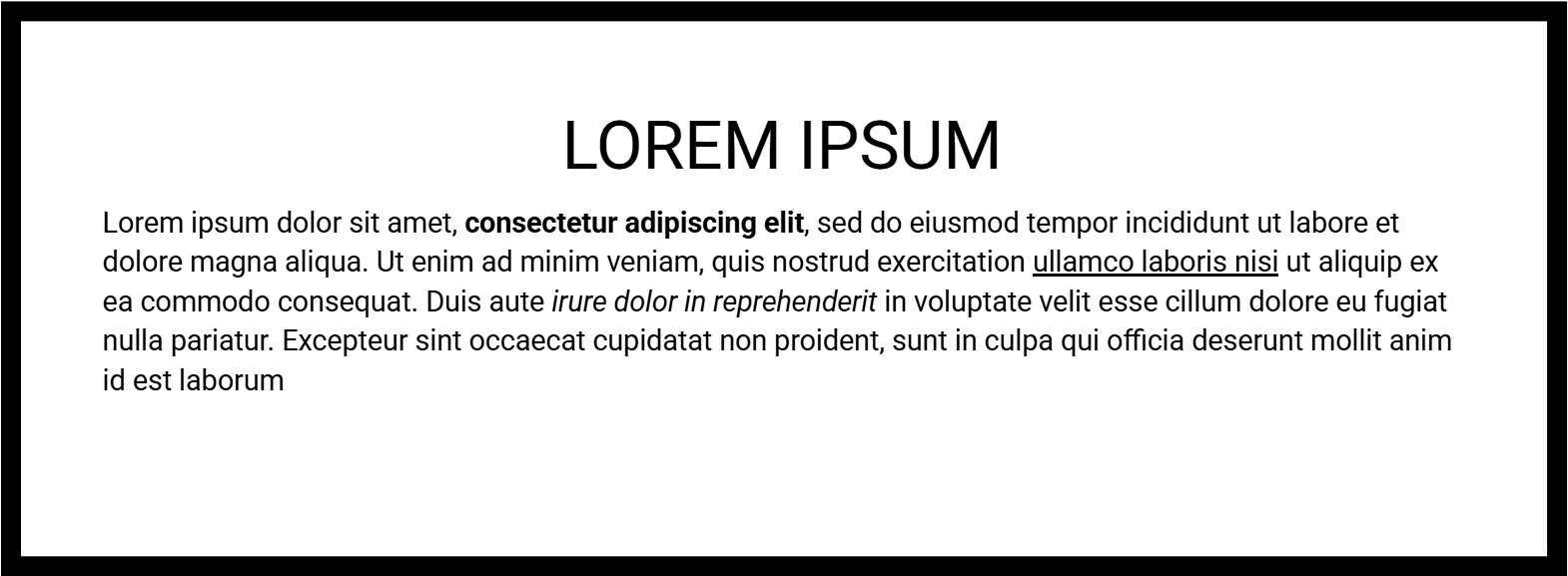
One of the best things about Roboto is how well it adapts to any industry. Many fonts for resume struggle to balance personality and professionalism, but Roboto nails it. It’s also ATS-friendly, meaning no robots (or recruiters) will have trouble reading your resume. For a polished, contemporary look, Roboto is a top choice among fonts for resume formatting.
3. Open Sans
When it comes to resume design, Open Sans is like that perfectly tailored suit—professional, stylish, and never out of place. Their clean and modern appearance makes them excellent choices for job seekers who want clarity without clutter.
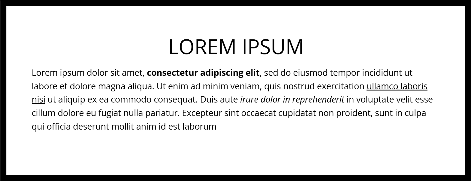
One reason Open Sans stands out among fonts for resume is their readability. Hiring managers don’t want to struggle with cramped or confusing fonts, and this ensures that your resume remains effortlessly skimmable. Plus, they’re ATS-friendly, so no formatting disasters here! If you want fonts for resume that blend professionalism with ease of reading, Open Sans is unbeatable.
4. Lato
If fonts for resume had personalities, Lato would be the charismatic professional who nails every interview. It’s modern yet warm, making it an excellent choice for job seekers who want their resumes to feel polished but not too stiff. Lato is one of the few fonts for resume that seamlessly blends structure with a subtle friendliness, ensuring that your application feels both professional and inviting.
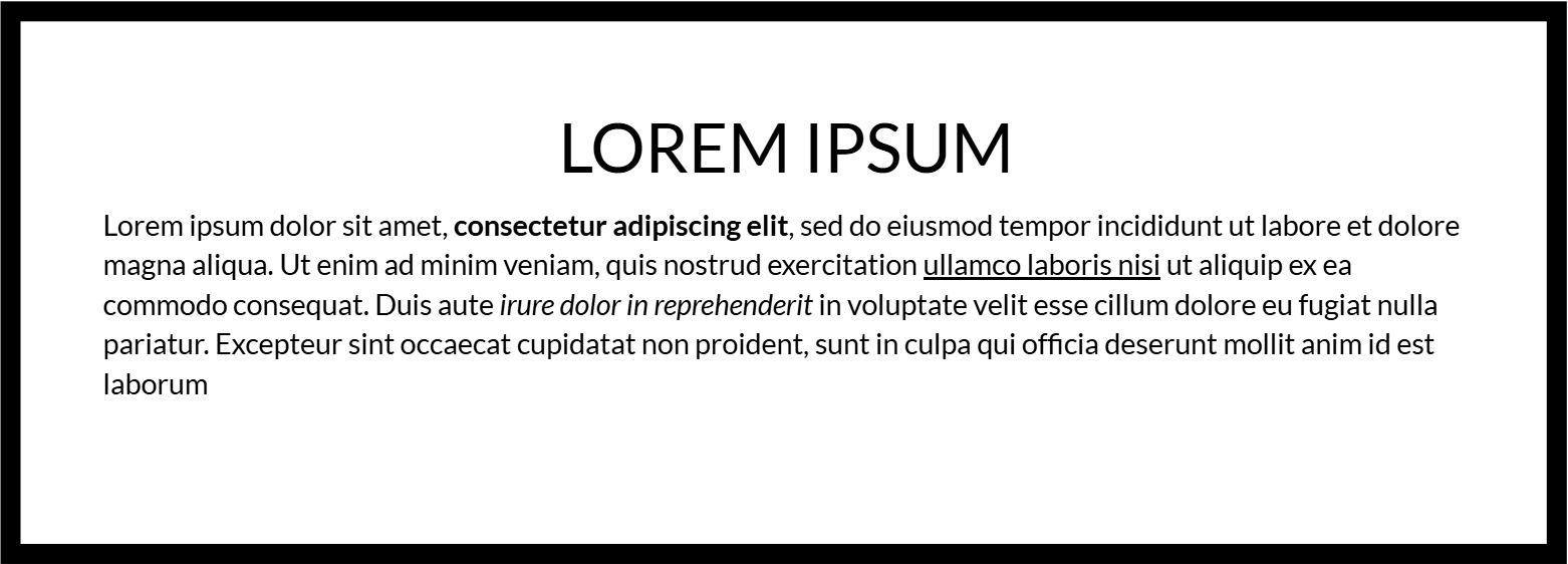
When scanning resumes, hiring managers appreciate clarity, and Lato delivers with its clean, easy-to-read letterforms. Among fonts for resume, Lato stands out because it maintains readability across digital and print formats. Whether you’re applying for a creative role or a corporate job, this font ensures your resume stays both stylish and professional. No awkward formatting surprises—just a sleek, well-balanced layout that recruiters will love.
5. Source Sans 3
For job seekers looking for fonts for resume that prioritize readability without sacrificing style, Source Sans 3 is an excellent choice. Designed for digital clarity, this font ensures your resume is crisp and legible on any screen. Whether it’s read on a recruiter’s phone or printed for an in-person interview, Source Sans 3 keeps everything effortlessly professional.

As one of the most versatile fonts, it works well in any industry, from finance to tech to creative fields. It also pairs beautifully with bolder fonts for headings, keeping your resume structured and visually appealing. If you want fonts for resume that combine modern design with high readability, Source Sans 3 is a smart pick.
6. Libre Bakersville
If you love the traditional feel of serif fonts for resume but want something fresher than Times New Roman, Libre Baskerville is your answer. It carries the sophistication of Garamond with a slightly more modern touch, making it a fantastic option for those who want a classic yet updated look.
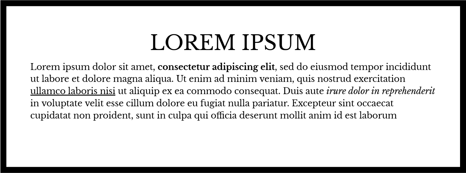
One of the biggest advantages of Libre Baskerville among fonts for resume is its refined readability. The spacing and letterforms ensure that your resume doesn’t feel cramped or outdated. Ideal for law, academia, and finance, this font conveys professionalism while keeping things visually elegant. If you want fonts for resume that exude tradition with a contemporary twist, Libre Baskerville is a great choice.
7. Montserrat
Want a font for resume that make a statement without being over-the-top? Montserrat is your go-to! With its bold yet approachable design, this sans-serif font adds a contemporary edge to your resume. It’s particularly popular in creative industries, but even for corporate settings, it brings a sense of confidence and style.

Among the many fonts for resume available, Montserrat is excellent for headings and name sections because of its strong, eye-catching presence. It keeps your resume visually structured while remaining professional and easy to read. If you’re looking for fonts for resume that help your application stand out without losing credibility, Montserrat is a fantastic option.
8. Bitter
For those who love serif fonts for resume, Bitter is an excellent choice that offers a subtle modern twist. Unlike older serif fonts, Bitter was designed with digital readability in mind, making it ideal for resumes that may be viewed on screens first.
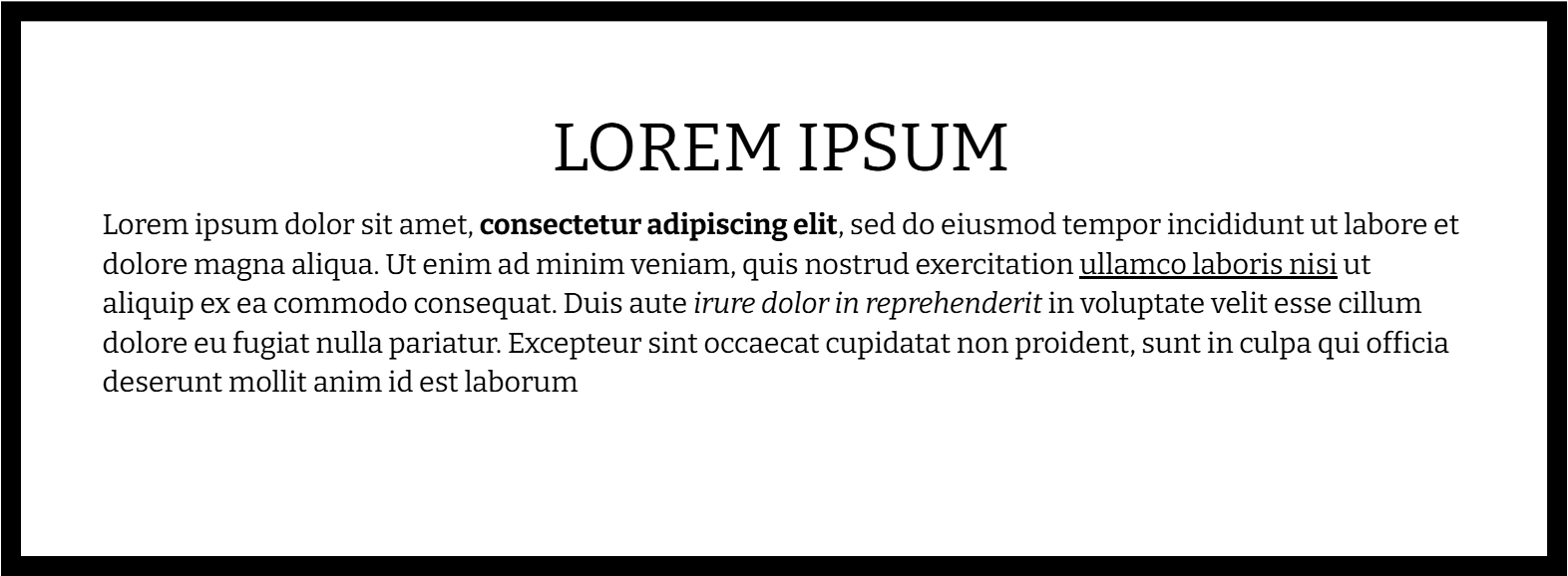
Among fonts for resume, Bitter is particularly strong for professionals in writing, publishing, and academia. Its sophisticated letterforms make it easy to read while adding a touch of refined personality. If you’re looking for a font that combine a timeless feel with a digital-friendly edge, Bitter is a perfect match.
9. PT Sans
Sometimes, the best typefaces are the ones that feel effortlessly natural, and PT Sans is one of them. Designed for maximum readability, this font strikes the perfect balance between modern and professional. It’s clean without feeling cold, making it a great choice for a variety of industries.

When selecting a typeface, job seekers often overlook PT Sans, but its smooth letterforms and approachable design make it a hidden gem. Whether used for body text or headings, it maintains a polished aesthetic. If you want a font that feels well-structured and easy on the eyes, PT Sans is an excellent pick.
10. Rubik
Rubik is the kind of font that knows how to make a great first impression—confident, modern, and just the right amount of approachable. With its slightly rounded edges, it has a warmth that stands out without straying into informal territory.

Ideal for job seekers who want a polished but fresh look, Rubik works well across industries. It remains ATS-friendly while adding a unique touch that sets your resume apart. If you’re looking for a typeface that balances personality with professionalism, Rubik is a top pick.
Why Font Choice Matters?
Choosing the right font is crucial because it directly impacts how hiring managers perceive your resume. Fonts such as Calibri and Arial provide a modern, clean look, while Times New Roman and Garamond maintain a traditional and sophisticated appearance. Helvetica, Trebuchet MS, and Calibri Light offer a contemporary edge without sacrificing professionalism.
Additionally, applicant tracking systems (ATS) often scan resumes before they reach human eyes. Using an ATS-friendly font like Arial, Calibri, or Cambria ensures that your resume is correctly parsed and remains readable.
Key Reasons Font Choice Matters:
- First Impressions Count:
- The font you use shapes how hiring managers perceive your resume at a glance.
- A clean, modern font conveys professionalism and attention to detail.
- Readability and Clarity:
- Some fonts are easier to read than others, especially in digital formats.
- Clear fonts ensure that hiring managers can quickly absorb key information.
- Professionalism and Style: Different fonts convey different tones:
- Modern and Clean: Arial, Calibri, Trebuchet MS
- Traditional and Sophisticated: Times New Roman, Garamond
- Contemporary Edge: Helvetica
- Applicant Tracking System (ATS) Compatibility:
- Many companies use ATS software to scan resumes before they reach a recruiter.
- Fonts like Arial, Calibri, and Cambria are ATS-friendly and ensure proper parsing.
- Using an uncommon or decorative font could cause formatting issues, making your resume difficult to process.
Fonts to Avoid on Your Resume
Your resume’s font choice says a lot about you, so don’t let it scream, “I made this in five minutes!” While some fonts might be great for birthday invitations or pirate-themed restaurants, they have no place on a professional resume. Here are three fonts you should definitely avoid:
1. Comic Sans
Ah, Comic Sans. The font that instantly makes hiring managers question their life choices. It’s playful, quirky, and, unfortunately, completely unprofessional. Unless you’re applying to be a clown (or writing a letter to your childhood pen pal), steer clear of this one.

2. Papyrus
Papyrus looks like something Indiana Jones would find on a lost scroll, not a job application. Its uneven, textured style might work for an Egyptian-themed adventure movie, but on a resume? Not so much. Employers don’t want to decipher ancient runes. They want clean, easy-to-read text.

3. Courier New
Courier New makes your resume look like it was typed on an old-school typewriter in the 1950s. While vintage can be cool, this font is clunky, hard to scan, and takes up way too much space. Keep it modern and ditch the typewriter vibes.

For a resume that actually gets noticed in a good way, stick with clean, professional fonts like Arial, Calibri, or Garamond. Your future employer will thank you!
Best Practices for Font Use in Resumes
When it comes to crafting a stellar resume, font choice and formatting play a bigger role than you might think. A well-formatted resume isn’t just about what you say—it’s also about how easy it is to read. Follow these best practices to ensure your resume looks polished, professional, and easy on the eyes.
- Stick to Professional Fonts – Use clean, easy-to-read fonts like Calibri, Arial, Helvetica, Garamond,etc to maintain a polished and professional appearance.
- Keep Font Size Readable – Use 10-12 points for body text and 14-16 points for headings to ensure clarity without wasting space.
- Maintain Consistency – Stick to one font throughout your resume. Mixing multiple fonts can make your resume look unorganized and unprofessional.
- Use Bold and Italics Sparingly – Highlight key sections like job titles or company names with bold text, and use italics for secondary details like employment dates. Avoid overusing these styles to keep your resume clean.
- Ensure Proper Line Spacing – Use 1.0 to 1.15 spacing to make your resume easy to read while maximizing space.
- Consider Applicant Tracking System (ATS) Compatibility – Use ATS-friendly fonts like Arial, Calibri, Cambria, and Times New Roman to ensure your resume is properly scanned by hiring software.
Conclusion
At the end of the day, your resume’s font choice should be the silent hero, making your qualifications shine without stealing the spotlight. Whether you go for the modern and sleek Calibri, the timeless and traditional Times New Roman, or the stylish and refined Garamond, picking the right font for resume writing ensures that your skills and achievements get the attention they deserve.
Remember, your resume is your first handshake with a potential employer, make it firm, confident, and professional. Ditch the decorative distractions, embrace readability, and let your experience take center stage. With the right fonts for resume design, you’ll be one step closer to landing your dream job. Now, go forth and format wisely!

