If UI design libraries were superheroes, Shadcn UI components library would be the slick, utility-first vigilante—quietly powerful, totally customizable, and always in control.
Whether you’re a solo dev hacking together a portfolio or part of a startup racing to MVP, chances are you’ve heard whispers about Shadcn in the Tailwind-verse. And with good reason.
No bloated packages. No one-size-fits-all styles. Just copy-paste-ready, fully customizable components that play nice with Tailwind CSS and let you call the shots.
In this guide, we’re diving deep into the shadcn UI components free list, featuring the top UI building blocks you can use right now, along with hidden gems, download tips, and even some cool alternatives. Ready to level up your UI game? Let’s roll.
What Is Shadcn UI?
Built on top of Tailwind CSS and Radix UI, Shadcn UI is an innovative, adaptable, and user-friendly UI component library. It offers developers a fully customizable set of UI components designed for scalability, performance, and design consistency.
Check out Flowbite, another Tailwind CSS UI library
Unlike traditional UI kits, Shadcn UI components library doesn’t ship components as npm packages. Instead, it provides ready-to-use components that you copy into your own project, giving you full control of customization without worrying about overrides or limitations. It’s an innovative approach that feels both developer-friendly and empowering.
In the rapidly evolving front-end ecosystem, where customization is king, Shadcn UI components library brings a breath of fresh air for those tired of rigid libraries.
Why Use Shadcn UI?
Whether you’re working on a startup dashboard, an eCommerce admin panel, or a sleek portfolio website, Shadcn UI components library delivers components that are:
- Customizable: Each component lives in your codebase, giving you the ability to style or modify it however you like.
- Accessible: Built on top of Radix UI primitives, these components follow accessibility best practices. You should know the best practices for accessible websites.
- Tailwind-Ready: With Tailwind CSS’s smooth integration, you can quickly style components using utility classes.
- Free and Open Source: All components are freely available and community-supported.
- Performant and Scalable: Built with modern best practices to ensure efficiency. Before adding new UI components, run your site through free website speed test tools to make sure you’re not bloating performance.
If you’re exploring shadcn ui components free, this library is a treasure trove. Developers love the mix of freedom and functionality it offers.
Best Free Shadcn UI Components
Design shouldn’t be a barrier while developing a React application. Here comes Shadcn UI components library, a developer-focused component set based on Tailwind CSS and Radix UI. You get the best of both worlds with it: complete style control and easily accessible components.
Not sure which colors to use? These color palette generators can help you pick the perfect scheme for your UI
Shadcn UI provides a surprisingly straightforward alternative to bulky npm packages: copy and paste the code, make the necessary adjustments, and you’re ready to go. No lock-in to the design system. No conflicts of style.
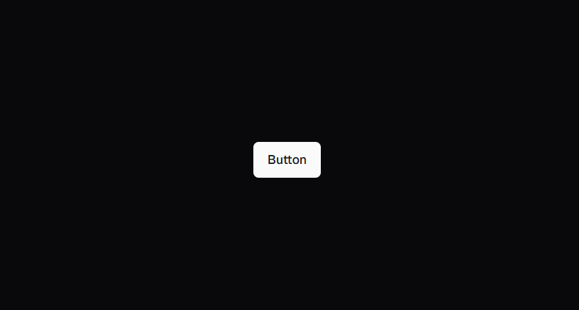
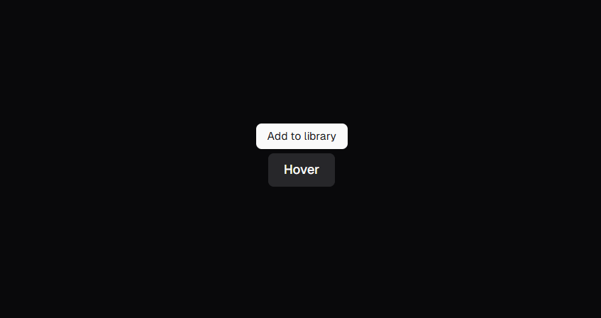
1. Button
Buttons are the building blocks of interactivity. The Shadcn UI Button component comes with multiple variants (default, outline, ghost, link) and size options, making it perfect for CTAs, form submissions, or navigation.
Features:
- Tailwind utility-based styling
- Easily extendable with icons or loading spinners
- Built-in support for disabled states and accessibility
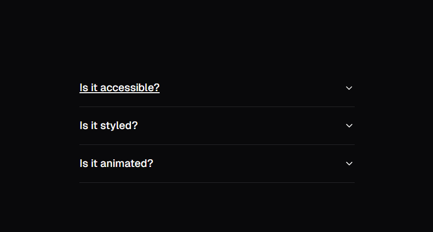
2. Accordion
Use this expandable panel for FAQs, collapsible menus, or step-by-step tutorials. The Shadcn Accordion is keyboard navigable and uses Radix primitives for accessibility.
Features:
- Supports single or multiple open sections
- Smooth transitions
- Fully accessible with ARIA attributes
3. Alert Dialog
This modal dialog is perfect for confirmations like “Are you sure you want to delete this?” scenarios. It keeps users focused on critical decisions with a dimmed backdrop and clear call-to-action buttons.

Features:
- Focus trapping and return
- ESC key to close
- Styled with Tailwind and extendable
4. Avatar
Great for user profiles, team lists, or comment sections. Shadcn’s Avatar component shows a user image and falls back to initials if the image fails to load.
Features:
- Rounded or square variants
- Auto-fallback to user initials
- Small file footprint
Show off your new Shadcn components using these free mockup websites for slick presentations
5. Badge
Need to show a status like “New,” “Draft,” or “Online”? Use the Badge component to communicate context with color-coded labels.
Features:
- Easily themed using Tailwind
- Perfect for statuses, filters, or tags
- Multiple color variants (success, warning, error)
6. Card
Cards help you group content in a structured way — think blog previews, user profiles, or pricing plans. Shadcn UI’s Card layout is minimal but flexible.
Features:
- Includes header, content, and footer slots
- Responsive design by default
- Clean layout with soft shadows and borders
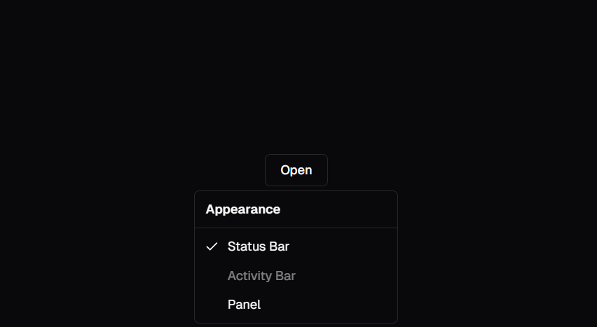
7. Dropdown Menu
Shadcn’s Dropdown Menu is a must-have for contextual actions, settings menus, or user profile options. It supports keyboard navigation and nested items.
Features:
- Custom triggers (buttons, icons, etc.)
- Aligns perfectly on screen
- Great for “More actions” or “Kebab menus”
8. Form Inputs
Forms are hard. Shadcn makes it easier with beautifully styled input fields that work seamlessly with libraries like React Hook Form and Zod for validation.
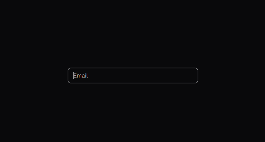
Features:
- Input, textarea, checkbox, and radio components
- Consistent padding, borders, and error states
- Plug-and-play with existing React form logic
9. Tooltip
Need to provide context without cluttering your UI? Tooltips are perfect. The Shadcn Tooltip component appears on hover or focus and disappears gracefully.
Features:
- Delay before showing
- Can be positioned in any direction
- Fully accessible and keyboard friendly
You can even integrate Shadcn components into Unbounce landing page templates for a custom touch.
10. Tabs
For dashboard sections, profile pages, or switching views, Tabs help organize content in a compact and elegant way.
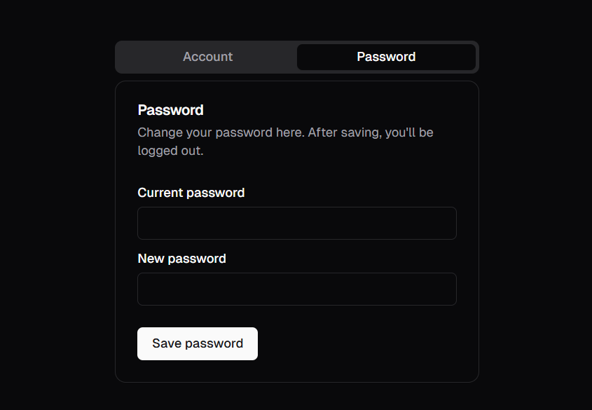
Features:
- Horizontal tab layout
- Smooth tab panel transitions
- Easily customizable with Tailwind
11. Popover
When you need more space than a tooltip but don’t want a full modal, use Popovers. They’re great for calendars, login forms, or mini-menus.
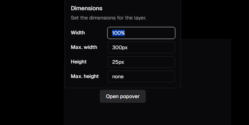
Features:
- Non-modal overlays
- Positioned with smart alignment
- Closes on outside click
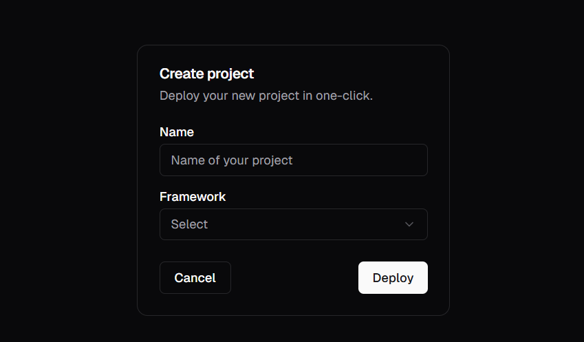
12. Dialog
This full-featured modal is ideal for editing forms, file upload interfaces, or any complex interaction that requires a user’s full attention.

Features:
- Focus management and accessibility baked in
- Scroll locking
- Easy to animate and theme
Shadcn UI Tree View Component
One of the most in-demand additions to any shadcn UI components library list, is a tree view component.
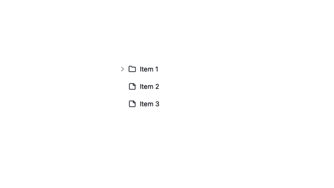
Although not included in the official starter pack, some devs have extended Shadcn to include a Tree View using Radix primitives + Tailwind. Here’s an unofficial but awesome one:
- Shadcn Tree View Demo: Shadcn Tree View Component (unofficial)
- Features:
- Expand/collapse branches
- Keyboard accessibility
- Icons and nesting support
This makes it perfect for file explorers, menu hierarchies, or JSON viewers.
Want full styling control? Here’s how to add custom CSS in WordPress to override or tweak Shadcn defaults.
How to Download Shadcn Components?
Setting up Shadcn components library in your project is incredibly simple. Here’s how you can get started.
Step 1: Create a Next.js App
npx create-next-app my-app
cd my-app
Step 2: Initialize Shadcn UI
npx shadcn-ui@latest initYou’ll be prompted to set up Tailwind, TypeScript, and the component folder structure.
Step 3: Add Components
npx shadcn-ui@latest add buttonThis command installs the component directly into your components/ui/ folder. You now have full access to modify it.
Step 4: Import Component
The command above will add the Button component to your project. You can then import it like this:
import { Button } from "@/components/ui/button"

export default function Home() {
  return (
    <div>
      <Button>Click me</Button>
    </div>
  )
}
Whether you’re building fast or learning UI development, this shadcn download process is refreshingly efficient.
Tips for Using Shadcn UI in Real Projects
To get the most out of shadcn UI components free, here are a few practical tips:
- Group Components by Domain: Organize components by feature (e.g., Auth, Dashboard) to stay maintainable.
- Theme with Tailwind: Use Tailwind’s config to manage design tokens like spacing and colors.
- Extend Components Safely: Since you’re copying them, feel free to adjust props and logic — just keep changes consistent.
- Monitor Updates: Join the Shadcn UI GitHub and community discussions for updates and new components.
- Combine with CMS or APIs: These components shine in dynamic apps — integrate them with your headless CMS, Firebase, or Supabase projects.
Shadcn UI offers flexibility that few libraries can match. Make sure to leverage its strengths by pairing it with modern workflow automation plugins for best results.
Pair these components with free open source icon libraries to maintain a cohesive visual language across your app.
Shadcn UI Alternatives
Looking for a shadcn ui alternative? These libraries are solid picks if you want pre-built or headless components depending on your styling approach:
| Alternative | Key Features |
|---|---|
| Radix UI | Low-level primitives used in Shadcn |
| Headless UI | Tailwind-based with accessibility baked in |
| Mantine | React components with hooks and styles |
| Chakra UI | Styled system with dark mode and themes |
While Shadcn UI is fantastic, the above component libraries worth exploring.
Not sure how to design around these components? Our UI design best practices guide can help you get started.
Bonus: Shadcn UI Component Generators
Several third-party tools now offer visual or CLI-based interfaces to install free shadcn components, including:
- Vercel AI Templates: Pre-styled templates using Shadcn UI
- Shadcn CLI Extensions: Plugins that auto-generate multiple components
- Framer to Shadcn: Convert Framer prototypes into Shadcn-style code (experimental)
These tools are great if you want to expand your shadcn components list quickly.
Conclusion
At the end of the day, Shadcn UI isn’t just another component library, it’s a developer’s toolkit for building beautiful, accessible, and totally custom interfaces without the fuss.
From buttons and badges to modals and tree views, the shadcn components list gives you everything you need to create smooth, scalable apps with style.
Whether you’re chasing pixel-perfection or just need a solid base to build on, Shadcn UI has your back. And the best part? It’s all free, open-source, and built for performance. So go ahead, fork, tweak, remix, and make it your own. The future of frontend just got a whole lot cleaner.
Happy building!