Running a WooCommerce store is exciting, but let’s be honest, getting people to click “Add to Cart” is just the first step. The real test is what happens next. That final step, the WooCommerce checkout, is where your hard work turns into real sales.
If your WooCommerce checkout page is boring, confusing, or too complicated, customers can leave without buying a thing. That means less money for you and more abandoned carts to chase down.
So what’s the solution? Learning how to edit your WooCommerce checkout page so it matches your brand and keeps shoppers smiling.
In this complete guide, you will learn step-by-step how to edit WooCommerce checkout, improve your woo cart WordPress flow, and make your cart page and add to cart and checkout process smooth like butter.
Whether you want to keep it simple or go all-in with advanced tools, you will find tips that work for any skill level. Let’s jump in and turn your WooCommerce checkout into a conversion machine.
🔍 Understanding Your Cart and Checkout Pages
Before you jump into making changes, it helps to know how your shop’s main pages work together. When you first install WooCommerce, it automatically creates two important pages: the cart and the checkout.
🛒 What Happens on the Cart Page?
Think of the cart as your customer’s shopping basket. This is where people can double-check what they’re about to buy. They can see each item, update quantities, apply coupons, or remove things they no longer want.
The cart page gives shoppers a moment to pause and review before they move forward to pay. A clear cart page sets the stage for a smooth checkout.
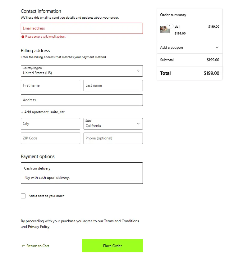
✅ What’s the Role of the Checkout Page?
Once someone’s happy with what’s in their basket, they move to the final step, the checkout. This is where they share their address, choose how to pay, and place the order.
A good checkout feels simple and safe. It should guide people through payment details without making them feel overwhelmed. The modern checkout uses blocks in WordPress, which makes it easy to adjust how things look and what shoppers see.
🧩 How They Work Together
The cart and checkout pages are a team. Shoppers go from picking products to reviewing them, to paying, all in a few clicks.
Some stores even skip the cart step for certain products, sending shoppers straight to checkout for a quicker process. No matter how you set it up, these two pages shape the final moments of the shopping journey.
🚀 Why Bother Editing Your WooCommerce Checkout Page?
If you’re wondering why you should spend time tweaking your WooCommerce checkout, here’s the answer: shoppers are quick to abandon their cart if the process is clunky.
The default WooCommerce checkout page works fine, but “fine” does not mean it’s the best for your business. Shoppers want checkout pages that feel fast, easy, and safe. When your WooCommerce checkout is too long or confusing, people start looking for that “X” button instead of the “Place Order” one.
When you customize your WooCommerce checkout, you remove obstacles and build trust. You can remove unnecessary fields, reorder sections, add clear instructions, and highlight trust signals like secure payment icons.
You can edit your checkout page according to your store’s vibe! WordPress editor allows you to add WooCommerce shortcodes and customize the checkout (and infact every user-attached page)
Benefits of a Custom WooCommerce Checkout
Let’s break it down. A better WooCommerce checkout can:
✅ Speed up the purchase process
✅ Make mobile checkout easier
✅ Add upsells or cross-sells for extra revenue
✅ Reduce cart abandonment
✅ Match your branding for a polished feel
✅ Increase customer trust with secure payment icons and guarantees
Small tweaks to your WooCommerce checkout can make a huge difference in your bottom line. So, whether you sell handmade candles or high-tech gadgets, improving your WooCommerce checkout is always worth it.
How to Edit the WooCommerce Checkout Page Without Coding?
Good news, you don’t need to be a web developer to make your checkout page look better and work smarter. The modern WooCommerce Block Editor makes customizing your cart and checkout pages simple for anyone, even if you’ve never touched a line of code. Don’t forget to check your taxes during checkout setup.
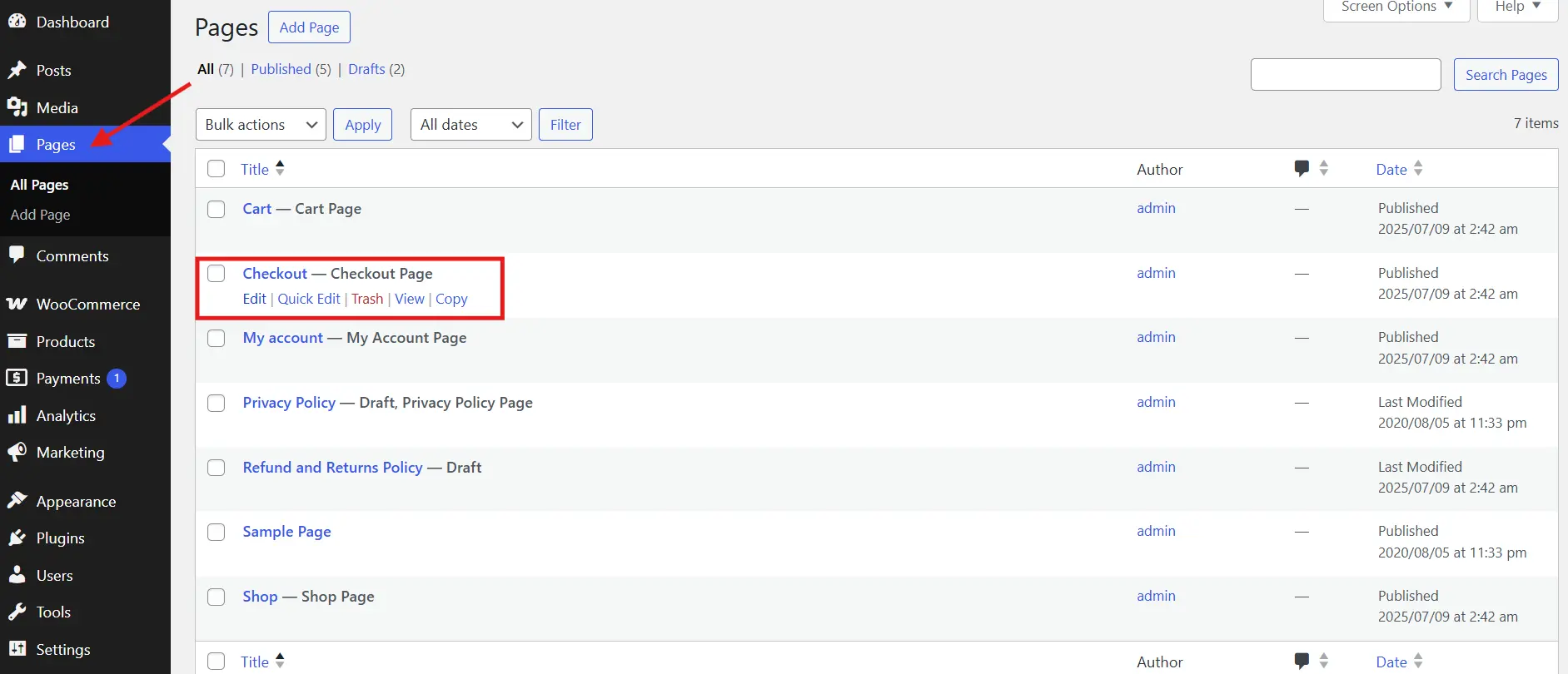
✅ Open the Checkout Page in the Editor
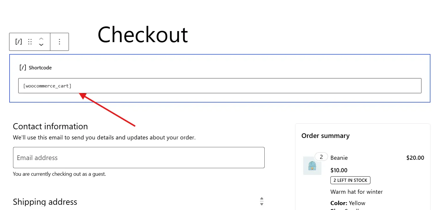
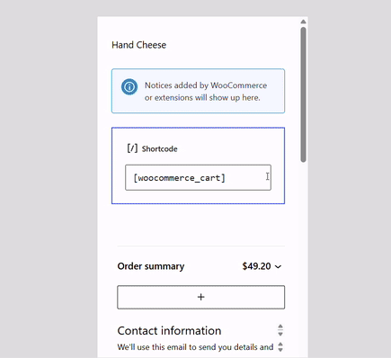
To start, go to your WordPress dashboard. Click on Pages and find the page named Checkout. Open it in the Block Editor.
You’ll see a special block called the Checkout Block. This block controls what shoppers see when they reach the final step of buying. If you click on it, you’ll notice settings in the right sidebar where you can adjust how things look.
✅ Adjust the Layout and Settings
Inside the block’s settings, you can choose whether you want a single-column or two-column layout. Some stores look cleaner with a one-column checkout, especially on mobile. Others prefer a two-column style with billing and order review side by side.
You can also decide whether to show things like coupon fields, order notes, or login prompts for returning customers. These small tweaks help make the checkout easier for people to use.
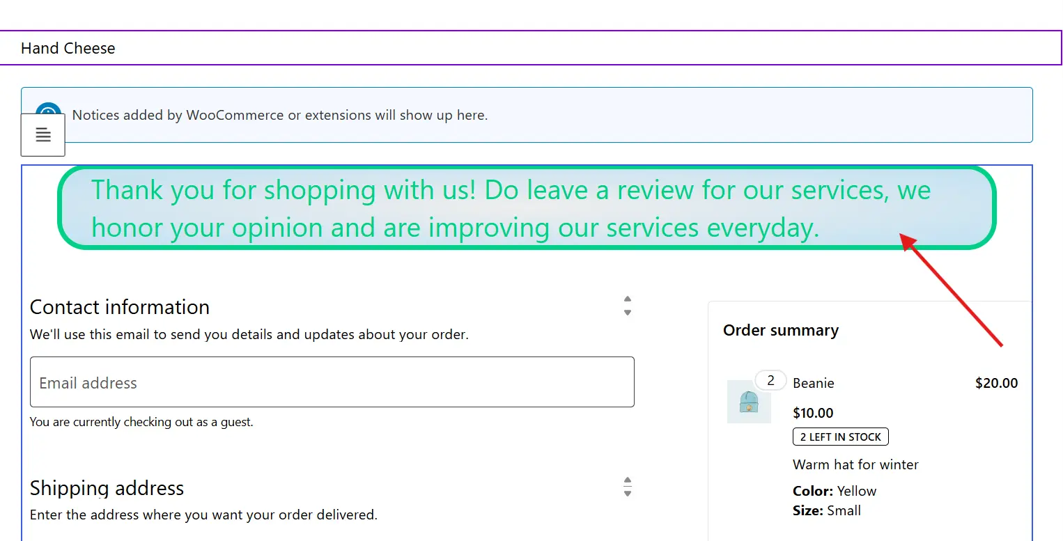
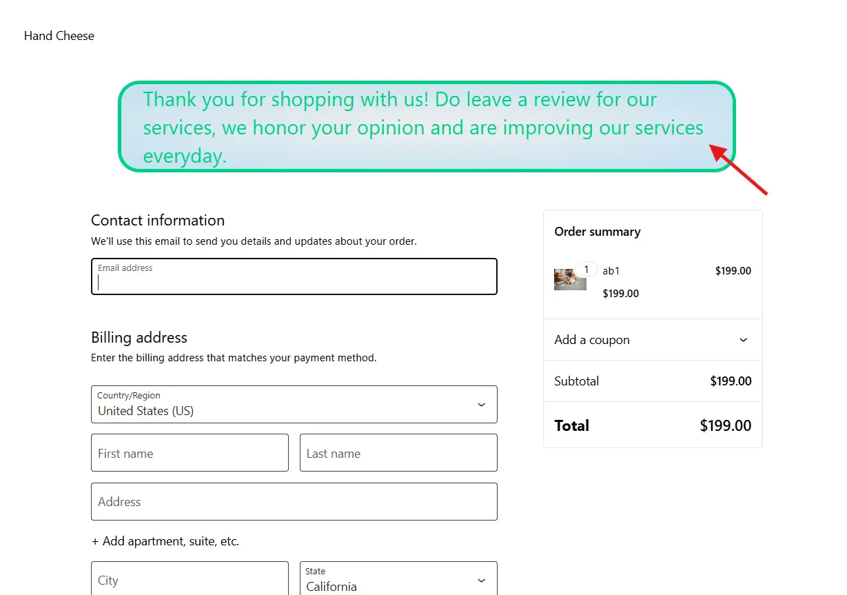
✅ Add Content to Build Trust
Want to make your checkout feel safer? You can easily add extra blocks above or below the Checkout Block. Many store owners add trust signals like security badges, money-back guarantees, or short text about shipping policies.
You might also add a FAQ section if shoppers often have questions right before buying. These details build confidence and help answer last-minute worries that might stop someone from completing an order.
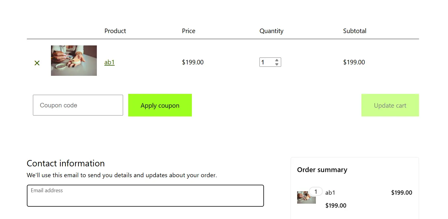
✅ How About the Cart Page?
The cart page works the same way. Find the Cart page in your Pages list and open it. You’ll see the Cart Block. Click on it to adjust settings like layout, cross-sells, coupon options, and notices.
Adding clear messages about shipping, discounts, or return policies can also reduce confusion and encourage people to move from the cart to the checkout smoothly. Make a login page that matches your checkout style.
⚡ Make Buying Faster by Skipping Extra Steps
Most online stores send people from the product page to the cart, then to the checkout, then to a thank-you page. That’s a lot of clicks. Sometimes, shoppers just want to grab what they need and pay for it right away.
✅ When Skipping the Cart Makes Sense
If you sell simple products, digital downloads, or single-item orders, sending people straight to checkout can help close the sale faster. Fewer steps means fewer chances for someone to get distracted or change their mind. Learn to add custom add to cart links to personalize user experience.
✅ How to Do It
Some plugins can help you skip the cart step. For example, CartFlows Plugin lets you create special buttons that send shoppers straight from the product page to payment. Other plugins can add a “Buy Now” button under your usual “Add to Cart” one.
This way, people who already know what they want don’t have to click through the extra cart page at all. They can finish their order in one smooth step. New to plugins? Learn how to install a WordPress plugin one in minute.
💡 Pro Tips for a Checkout That Gets More Orders
Once your checkout page is set up, a few smart touches can make it work even better. Here are some simple tips that help shoppers feel good about buying from you. A faster store means a faster checkout too, learn how to speed things up in WooCommerce.
✅ Keep It Short and Clear
Long forms make people pause. If you don’t really need a piece of information, don’t ask for it. Fewer fields mean faster checkout and fewer chances for shoppers to get annoyed and leave.
✅ Make Forms Easy to Fill Out
Use clear labels for each field. If possible, turn on auto-complete for addresses so shoppers don’t have to type out every detail by hand. Small time-savers like this help people finish the process without frustration.
✅ Offer More Ways to Pay
Some shoppers prefer paying by card. Others like PayPal, Apple Pay, or even cash on delivery. Giving people different options makes them more likely to find something that works for them.
✅ Add Trust Signals
Show that your store is safe and reliable. Add small badges that remind people their payment is secure. Include a quick note about your return policy or money-back guarantee near the final button. These small things make people feel better about placing an order.
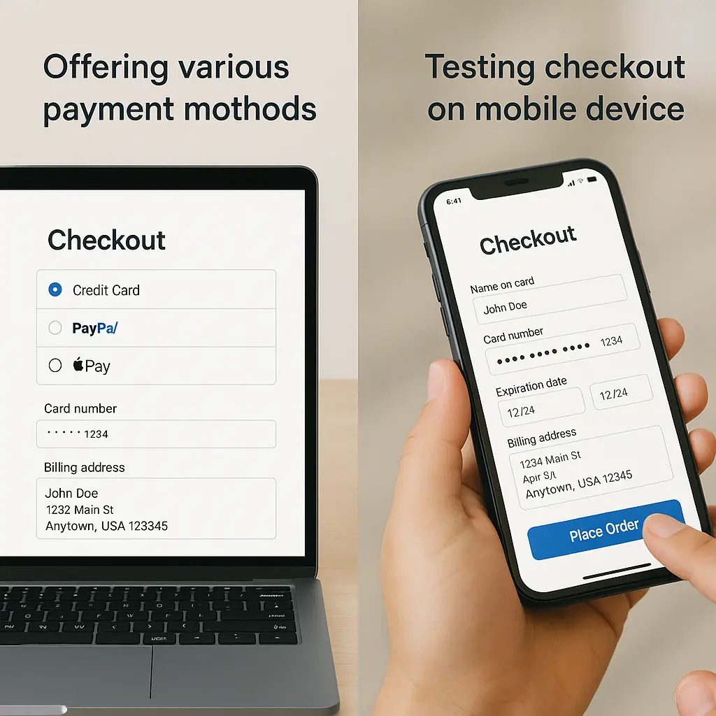
✅ Test on Phones
Many people shop on their phones. Always check that your checkout page looks good and works well on a small screen. Buttons should be easy to tap, and forms should be simple to fill out.
✅ Keep an Eye on Abandoned Carts
No matter how good your checkout is, some people will still leave halfway through. Use a simple plugin or your email tool to remind them to come back. Even a short follow-up can bring back sales you might have lost. Make sure your order emails reach customers every time!
Final Thoughts
Your checkout page is the last stop on your customer’s journey and one of the most important parts of your whole store. A few smart changes here can turn more visitors into paying customers without any complicated tools or big budgets.
Whether you keep it simple with the built-in editor or add extra power with trusted plugins, you have everything you need to shape a WooCommerce checkout experience that feels easy, secure, and worth finishing.
Keep things clear, build trust, and make every step smooth. When shoppers don’t have to think twice about clicking that final button, you win their business and maybe even their loyalty for next time.
So take what you’ve learned, open up your checkout page, and start testing small changes today. Better results might be just a few clicks away. Happy selling and grow your store with these amazing guides: