User Interface (UI) design is the secret ingredient behind every successful digital product! It’s what makes apps and websites easy to use, visually appealing, and, most importantly, keeps users coming back for more. A sleek, well-thought-out UI isn’t just about looking good; it enhances user experience, boosts engagement, and even increases conversions.
Think of it as creating a seamless conversation between humans and technology, one that feels intuitive and enjoyable.
From color schemes to typography, navigation to responsiveness, every detail plays a role in crafting an outstanding UI. And with design trends constantly evolving, staying updated is a must!
In this ultimate guide, we will walk you through everything you need to know about UI design. Get ready to dive into the world of stunning layouts, user-friendly interfaces, and cutting-edge tools that bring digital experiences to life. Let’s make UI design fun, functional, and fantastic!
Table of Contents
What is UI Design?
UI (User Interface) design is all about making digital experiences visually stunning and easy to navigate. It’s the art of crafting interfaces that users love to interact with, whether it’s an app, website, or software. A great UI ensures everything looks sleek, works smoothly, and feels intuitive.
Think of UI design as the bridge between users and technology. It includes elements like buttons, typography, icons, color schemes, and navigation menus, all working together to create a seamless experience. Every detail, from the placement of a button to the choice of a font, plays a role in making interactions effortless and enjoyable.
The ultimate goal is to design interfaces that are not only aesthetically pleasing but also enhance usability. A well-designed UI keeps users engaged, reduces frustration, and makes digital products more efficient. When done right, it feels almost invisible because everything just “works.”
So, whether you’re designing a website, a mobile app, or even a smartwatch interface, UI design is your secret weapon to creating something users will love. It is where creativity meets functionality, bringing digital experiences to life.
Principles of UI Design
Mastering the Art of an Eye-Catching and User-Friendly Interface calls for Empathy
Want to create digital experiences that people love? A sleek, functional, and enjoyable interface doesn’t just happen by chance. It follows a few golden rules that keep users happy and engaged. Let’s dive into the must-know principles for designing an interface that looks amazing and works like a charm!
⚡Keep It Crystal Clear 💡
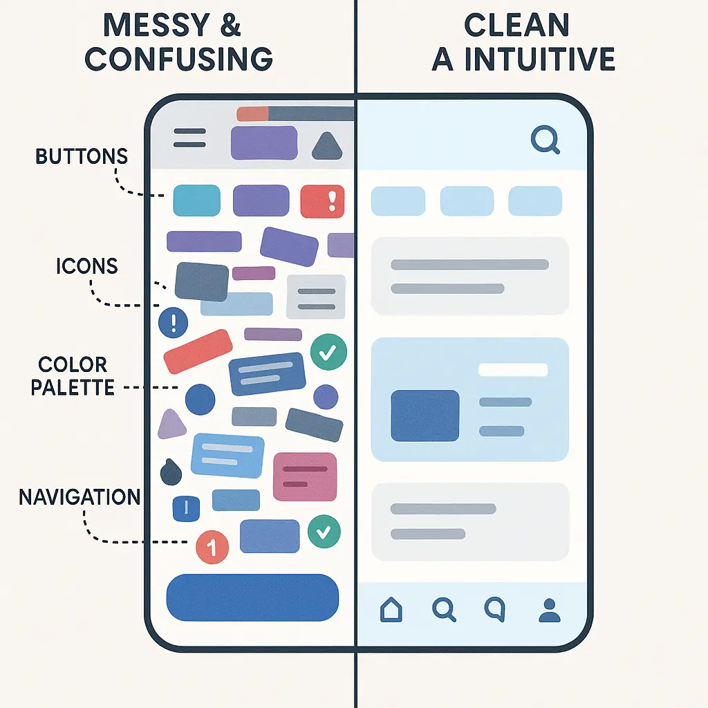
Ever opened an app or website and had no clue where to go next? That’s what we want to avoid! A well-designed interface should be easy to understand at first glance. No one likes clutter, so keep things neat and use simple, concise language. Buttons should look clickable, menus should be intuitive, and important information should stand out. When in doubt, simplify!
Good Example of Clarity:
Consider a login form on a website:
- Clear Labels: Fields are labeled “Email” and “Password,” with concise text placed directly above the input areas.
- Simple Buttons: A single button labeled “Log In” provides a straightforward call to action.
- Error Messages: If an incorrect password is entered, an error message states, “Incorrect password. Please try again,” offering clear guidance.
Bad Example of Clarity:
In contrast, a poorly designed login form might have ambiguous field labels, such as “Username” instead of specifying “Email,” a generic “Submit” button, and vague error messages like “Login failed,” leaving users uncertain about the issue.
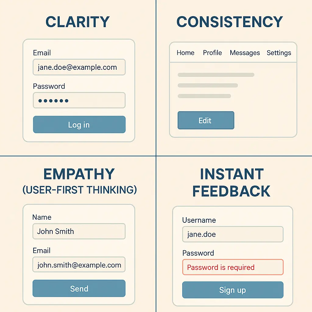
⚡Consistency is Key 🔄
Imagine switching between screens and seeing different fonts, random color schemes, or uneven spacing. It’s confusing, right? A consistent design makes navigation effortless and keeps everything looking professional. Stick to a defined style guide—pick a color palette, typography, and layout rules, then use them across the entire product. This creates a seamless and enjoyable user experience.
Good Example:
- A mobile app uses the same color scheme, typography or font styles, and button styles across all screens.
- Navigation elements (like a back button) are always positioned in the top left corner, ensuring users know where to find them.
- Icons for common actions (e.g., a trash bin for delete, a magnifying glass for search) follow industry standards.
Bad Example:
- One screen uses a green button for “Submit,” while another screen uses red for the same action.
- The same function (e.g., search) is triggered by a magnifying glass on one page and a text link on another.
- Different font sizes and styles appear randomly throughout the interface, making it visually chaotic.
⚡Think Like a User 👥
Great design isn’t just about aesthetics; it’s about solving problems. Before making any decisions, step into the user’s shoes. What are their goals? What frustrates them? Understanding user behavior, preferences, and pain points helps create an interface that feels natural and intuitive. If users have to “figure things out,” something needs fixing!
Good Example:
- A shopping app saves users’ addresses and payment details, allowing one-click checkout instead of forcing them to re-enter details every time.
- A guided tutorial highlights essential features rather than overwhelming users with too many options at once.
- A form auto-saves input data so users don’t lose their progress if they accidentally close the page.
- A mobile banking app ensures buttons are large enough for easy tapping, considering users with limited dexterity.
Bad Example:
- A travel booking site hides crucial options like “Modify Reservation” deep inside multiple submenus, frustrating users.
- A food delivery app requires users to input a promo code manually, without showing where to enter it during checkout.
- A streaming app doesn’t remember past searches or preferences, forcing users to manually find their favorite content each time.
- A delete button immediately erases an item without asking, leading to accidental data loss.
How to Think Like a User?
- Test as a First-Time User: Go through your UI design as if you’ve never seen it before.
- Observe Real Users: Conduct usability testing to see where people struggle.
- Minimize Friction: Reduce unnecessary steps that could frustrate users.
- Anticipate Mistakes: Provide clear guidance, helpful error messages, and easy recovery options.
⚡Instant Feedback is a Game Changer 🎮
Nobody likes pressing a button and wondering if it actually worked. A good interface always communicates with the user. Whether it’s a subtle animation, a success message, or an error alert, instant feedback reassures users that their actions have been registered. And don’t forget about responsiveness! Whether someone is using a laptop, tablet, or phone, everything should function flawlessly across different screen sizes.
Good Example:
- When a user submits a form, a success message appears: “Your request has been submitted successfully!”
- A button changes color when hovered over, indicating interactivity.
- A loading spinner appears when content is being processed, signaling to the user that the system is working.
Bad Example:
- A user clicks “Submit” on a form, but nothing happens—no confirmation message, no indicator of progress.
- A file upload fails, but no error message appears, leaving the user confused.
- A button looks clickable but does not respond when pressed, providing no indication of whether an action is occurring.
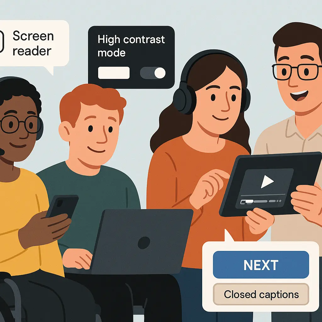
⚡Accessibility for All 🌍
Designing for inclusivity means making sure everyone can use your interface, including those with disabilities. High-contrast colors help users with visual impairments, readable fonts make text easy on the eyes, and alt text for images supports screen readers. An inclusive design isn’t just ethical—it also improves usability for everyone!
Developing Accessible Websites for WordPress in 10 Simple Ways!
Good Example:
- A website includes alt text for images, so visually impaired users using screen readers can understand the content.
- Text contrast follows accessibility standards, ensuring readability for color-blind users.
- A video player provides closed captions for users with hearing impairments.
Bad Example:
- A form uses light gray text on a white background, making it hard to read.
- A website relies solely on color to indicate error messages (e.g., “Fields outlined in red”), making it unusable for color-blind users.
- Interactive elements like buttons are too small to tap on mobile, making it frustrating for users with limited dexterity.
Essential UI Design Tools
Bringing your design ideas to life requires the right set of tools. With so many options available, choosing the best one can feel difficult. Whether you are wireframing, prototyping, or creating polished visuals, these tools will help streamline your workflow and enhance your designs. You can choose from the given options or go with some free UI mockup websites:
- Figma: A cloud-based design tool that allows for real-time collaboration. It is perfect for teams working remotely, enabling multiple designers to work on the same project simultaneously. Its flexibility and ease of use make it a favorite among professionals.
- Sketch: A widely popular tool among macOS users, especially for vector-based UI design. It offers a vast library of plugins and integrations, allowing designers to create pixel-perfect layouts with ease.
- Canva: An excellent option for quick UI mockups and creating graphic elements. With its drag-and-drop interface and vast template library, it is ideal for designers who need to create visuals quickly and efficiently.
PatternsWP: Explore a library of WordPress block patterns and full-page templates
UI Design Process
Designing a great user interface is not just about creativity. It requires strategy, structure, and a user-first mindset. A well-planned approach keeps your workflow smooth, your ideas focused, and your users engaged. Follow these key steps to bring your digital masterpiece to life.
1. Research and Planning 📝
Before jumping into design, take a step back and do some detective work. Who are your users? What do they like? What frustrates them? Understanding your audience’s needs and behaviors is the foundation of a great design. Next, analyze your competitors. What are they doing well, and where can you do better? Finally, stay updated on the latest design trends to ensure your interface feels modern and relevant. Once you have gathered all this information, create a clear strategy to guide your design decisions.
2. Wireframing 📐
Now it is time to sketch out the blueprint of your interface. Wireframes act as rough drafts, outlining the basic layout and structure before adding details. These simple, low-fidelity designs help visualize user flow and screen elements without distractions like colors and fonts. At this stage, the focus is entirely on functionality.
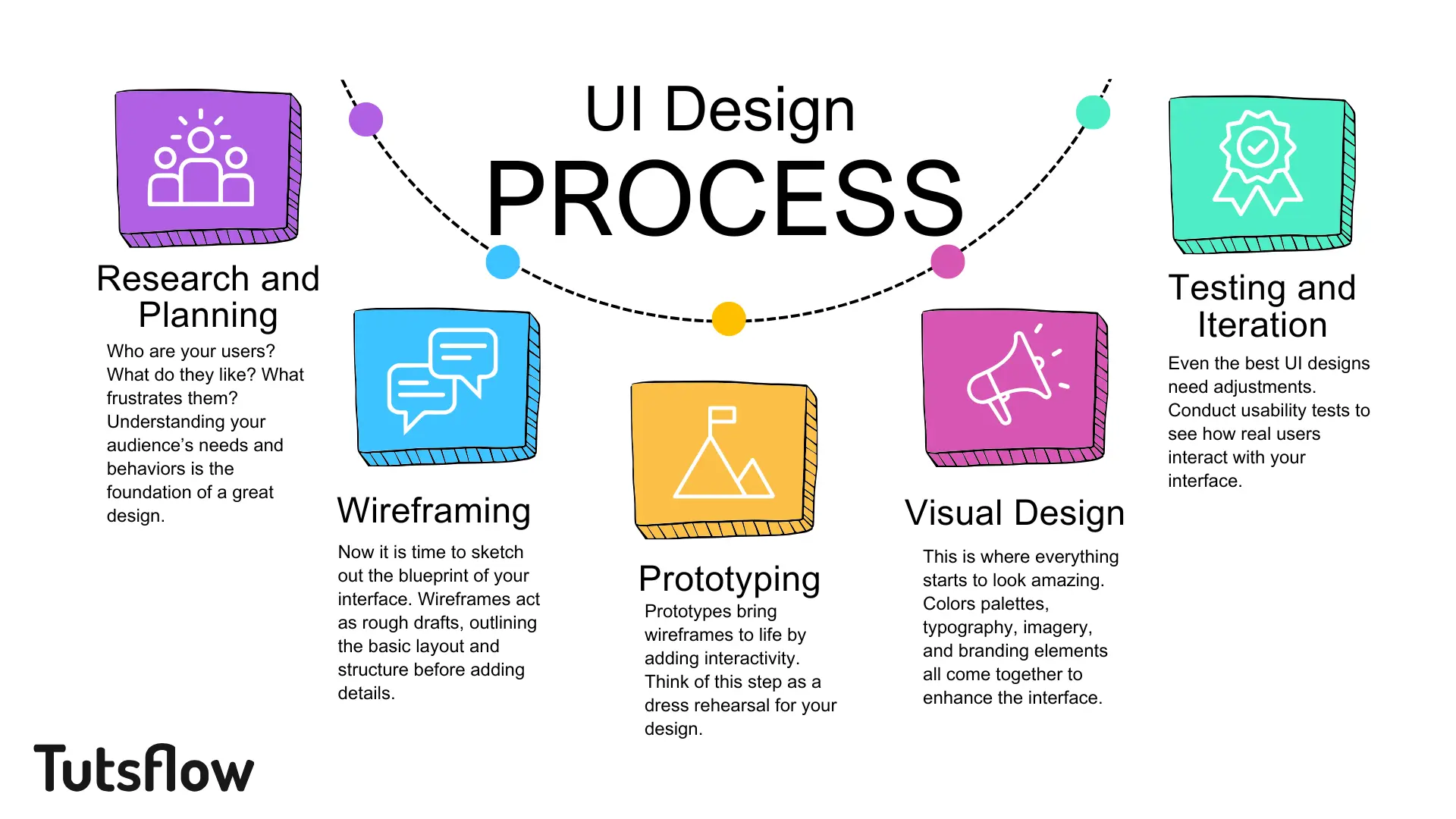
3. Prototyping 💡
Prototypes bring wireframes to life by adding interactivity. Think of this step as a dress rehearsal for your design. Users can click, scroll, and navigate through a working model of your interface. This allows you to test how intuitive and user-friendly your design is before committing to final visuals.
4. Visual Design 🎨
This is where everything starts to look amazing. Colors palettes, typography, imagery, and branding elements all come together to enhance the interface. A visually appealing design creates an emotional connection with users, making the experience more enjoyable. However, aesthetics should never come at the cost of usability. The perfect balance between beauty and function is what makes a design truly great.
5. Testing and Iteration 🛠️
Even the best UI designs need adjustments. Conduct usability tests to see how real users interact with your interface. Gather feedback, identify pain points, and refine accordingly. Iteration is the key to transforming a good design into a great one.
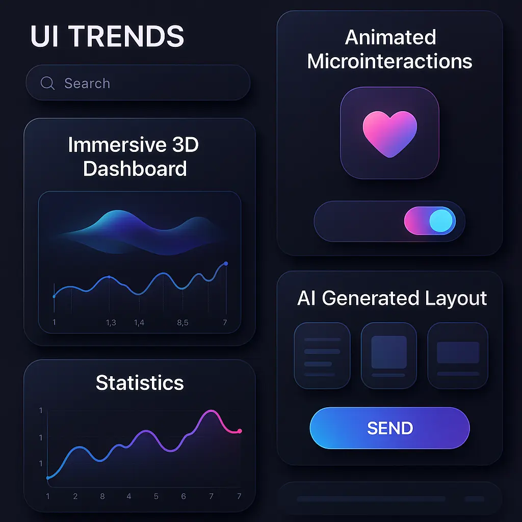
Latest UI Design Trends to Follow
To stay ahead in the UI design industry, keep up with the latest trends:
- Dark Mode UI: This trend continues to gain popularity due to its sleek and modern aesthetic. It not only enhances visual appeal but also helps reduce eye strain, especially in low-light environments. Many users now prefer dark mode options in their favorite apps and websites.
- 3D & Immersive Design: The use of 3D graphics and interactive elements adds depth and realism to digital interfaces. This trend enhances engagement by making designs more dynamic and visually appealing.
- Microinteractions: These small but meaningful animations make interactions feel smoother and more enjoyable. From button hovers to loading indicators, microinteractions enhance user engagement and provide instant feedback.
- AI-Powered Design: Artificial intelligence is revolutionizing UI design by automating tasks like layout generation and color selection. AI-driven tools help designers work more efficiently while personalizing user experiences.
Conclusion
UI design is more than just making things look good. It’s about crafting experiences that are intuitive, inclusive, and user-focused. When you apply principles like clarity, consistency, empathy, and instant feedback, your interface becomes effortless to use and hard to forget.
With the right tools like Figma, Sketch, Canva, and PatternsWP, and a solid process that moves from research to testing, you can bring ideas to life that truly connect with users. Staying current with trends like dark mode, immersive 3D, microinteractions, and AI-driven design ensures your work stays fresh and impactful.
Don’t aim for decoration, rather, aim for intention, usability, and delight.
🔗 Further Reading on Tutsflow
- 10 Free Design Resources to Make Better Websites
- Top Tailwind Templates and UI Kits
- Free Mockup Websites to Speed Up Your UI/UX Workflow
- Best Open Source Icon Libraries for Designers
These blogs offer the next steps in strengthening your design process and evolving your creative toolkit.